
Navbar plays a very important role in a website, so try your best to make it perfect and avoid common mistakes.
Here are some tips…
1. Keep it simple: A cluttered navbar can be overwhelming and confusing for users. Stick to the essentials and only include the most important links.
2. Use clear and concise labels: Make sure your labels are easy to understand and accurately describe the content they link to.
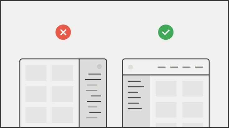
3. Make it easy to navigate: Ensure that the navbar is easy to use and navigate. Group related links together, and use drop-down menus if necessary.
4. Use whitespace effectively: Don’t be afraid of whitespace – it can help make your navbar look clean and organized.
5. Choose a font that’s easy to read: Use a font that is easy to read and legible, even at smaller sizes.
6. Consider the color scheme: Choose colors that complement your website’s overall design and branding. Be consistent with your color choices throughout the navbar.
7. Make it responsive: Ensure that your navbar is optimized for all devices and screen sizes.
— Here are some things to avoid:
1. Too many links: Avoid including too many links in your navbar. This can make it difficult for users to find what they’re looking for and can make the navbar look cluttered.
2. Confusing labels: Avoid using labels that are difficult to understand or don’t accurately describe the content they link to.
3. Small font size: Avoid using a font size that is too small, as it can be difficult for some users to read.
4. Inconsistent design: Avoid using different colors or fonts throughout the navbar. This can make it look disjointed and unprofessional.
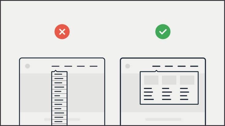
5. Long drop-down menus: If you’re using drop-down menus, avoid making them too long. This can make them difficult to navigate and can be frustrating for users.
6. Poor responsiveness: Avoid designing a navbar that doesn’t work well on mobile devices or smaller screens. This can make it difficult for users to navigate your website.